Design Decision: What I've learned While Building This Site

Building websites is easy, but building them with the intent of having them rank high in search engines and still have great readability takes some skills.
I know, I know. Just making your site SEO-compliant isn't going to be enough to climb the search ranking. There are tons of factors that are involved such as domain name authority, website age, and, arguably the most important factor, the content.
I'm not gonna talk about any of those
In this post, I want to talk about this website that you're on right now, my website. I want to talk about the decisions behind some parts of the website.

Let's Talk About The Blog Post Layout
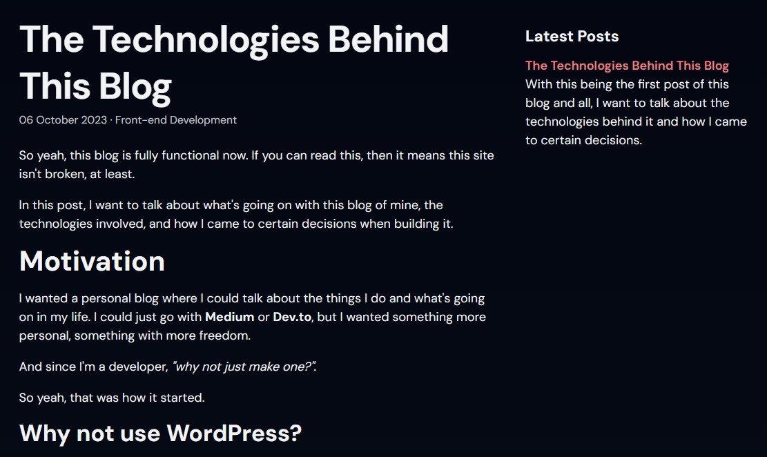
I decided to go with the standard content column with a sidebar inside a 1080-pixel container which feels quite right to me. It's not too big and not too small.
The Blog Post Body
The post body is 720 pixels wide. The reason I chose this was because, according to my research a quick Google search, 600-800 pixels is the most comfortable width for articles and blog posts as it's not too large that you have to turn your head or move your eyes too much while you read, and not too small that the text looks cluttered with no proper sentences.

As for the font, I went with a slightly bigger font size of 18 pixels for the paragraph text, as opposed to the default 16 pixels, since, personally, it feels much more comfortable to read and doesn't strain your eyes.
I was originally going to go with 20 pixels but it didn't look good. Even though it was easy to read, it looked zoomed in.
Everything else like the headings and the small text on the site is scaled relatively based on the 18 pixels.
The Sidebar
As for the sidebar, I made the rest of the container, 360 pixels in width, the sidebar. I wasn't originally going to include a sidebar, but there was a lot of blank space and modern screen resolutions are big enough to at least handle a container of this size so...yeah, might as well.
I put 5 latest posts on the sidebar to kind of fill in the void and it also serves as automatic internal linking, too, which is nice. And there's also enough space for potential ad placements which I'm definitely doing once the site gets some more visitors.
If you're reading this: Hello!
Things That Could Be Improved
Let's be honest. This site is NOT, in any way, perfect. I'm the best when it comes to web design. I still have a long way to go.
The Paragraph Height
I realized after actually taking a good look at the blog post body with real content that it's a little hard to read and distinguish paragraphs when there are a few paragraphs lining up back-to-back.
Right now, I set the line height to 1.5 times the font size, but the bottom margin of each paragraph also has a similar size, making it hard to see where a paragraph ends and another begins. I will either have to decrease the line height a bit or increase the bottom margin of each paragraph to make it more obvious. That's something I'll update in the future.
The Bold Texts

The bold words in paragraphs are super hard to tell that they are bold for some reason. It's likely because the regular texts are too bright, I think.
This is quite common for anything with dark themes. I might have to maybe decrease the opacity or make the regular words a little darker to make the bold words pop out more.
Closing Thoughts
So...yeah, I learned quite a lot designing this site. There are tons of things to think about as opposed to when you're working with a WordPress theme or UI libraries. I'll make sure to memorize all the mistakes and make my future projects better.
...That is NOT to say I won't be updating this site at all. I'll still keep updating it. It's my personal blog and a portfolio site, after all.